Page 38 - Indulge September 2017
P. 38
Bold colors

add vitality to

While some colors may be                       share a common denominator in terms            	 “Two vibrant colors, this duo would appeal
           synonymous with certain times of    of shade. Lavender, blue and an orchid         to those ready to explore a more dynamic
year, homeowners can employ bold colors in     pink are examples of such hues. This cool,     aesthetic. A wonderful choice for a kitchen,
their homes all year long. By embracing bold   regal combination can add femininity to a      these colors set against a backdrop of crisp
painting and decorating styles, homeowners     bedroom or even drama to another space in      white cabinetry and subway tile will afford you
can use fresh color palettes to make rooms     the house. If painting the walls dark blue or  a fun and vintage vibe,” says Papasimakis
more inviting and colorful. These popular      lavender seems scary, opt for a neutral shade  Fraccaro. “Consider this for a family room, as
color combinations can provide inspiration.    on walls and then dress up the space with      shades of red and orange are known to foster
                                               inky and violet accents.                       great conversation with family and friends. This
Green and pink                                                                                combination could also work really well with
                                                  “A wonderful union that offers any space    bursts of black and for those appealing to an
	 Colors on opposite ends of the color wheel   a sense of calm and relaxation. Perfect for    Asian theme.”
will always complement each other. Green       any bedroom, the lavender is lighter and
paired with pink calls to mind the great       more feminine, while the deep blue can         Gray and yellow
outdoors. These hues can add a touch of        bring in a masculine balancing quality,” says
floral spring sunshine even when that season   Papasimakis Fraccaro. “Great for a master or   	 Yellow is a pick-me-up color any time of
has long since passed. Opt for a deep green    guest bath — just imaging those two colors     the year, but, when combined with a gray, it’s
and a carnation pink for maximum impact.       together reminds me of being on vacation,      toned down to be soothing instead of startling.
And don’t forget a vase full of fresh blooms   and who wouldn’t want to bring a touch of      This color combination is popular in kitchens,
as the finishing factor.                       that into their home?”                         nurseries and entryways. Have fun in the
	 “These are two colors that we view                                                          kitchen with mottled gray stone countertops,
beautifully together in nature all the time,”  Turquoise and brick red                        pale yellow walls and canary café curtains.
says Lia Papasimakis Fraccaro of House                                                        	 “When pairing color, almost
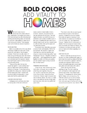
Splendid in Emmaus. “A very fresh pairing,     	 Enhance the “wow” factor with these          anything can go. The key is working
wonderful for a living room, bedroom or even   bold colors. Although they are striking,       with combinations that compliment and
formal dining room. And if coupled with        when they work together, they also             balance each other,” says Papasimakis
touches of gold or antique glass, it could     can impart a soothing feel, particularly       Fraccaro. “If designing with darker tones,
easily lend itself to a more exotic feel.”     since they are often inspired by Asian         lighten things up by accessorizing. Get
                                               influences. Feature a light turquoise sofa     reflective surfaces such as various metals,
Lavender and deep blue                         with red throw pillows. Or dress up meals      glass, and mirror. If designing with lighter
                                               with a red tablecloth on the dining table      hues, add some pops of contrast with darker
     Analogous colors are three colors that    and turquoise, white and red, patterned        accessories and woods for visual interest.”
sit side-by-side on the color wheel and        place mats.

38 | indulge • September 2017

